

CookCircle
Cook, Share, Savor
Where Recipes Meet Community
a cooking app where you can discover recipes, share your own creations, review and connect with others, and plan meals.
Many people want to cook at home but struggle due to lack of time, busy schedules, or convenience of eating out. Some might feel they lack cooking skills or confidence in the kitchen.
So they often resort to eating out, which can be expensive, less healthy, longer waits, and less control over ingredients. Cooking at home is usually cheaper, healthier, provides more quantities, and more environmentally friendly. It allows you to learn and improve your cooking skills.
Why does this matter?
Eating out adds up — in cost, in time, and in hidden ingredients. Cooking at home is healthier, cheaper, and a skill that pays off for life. But current apps either overwhelm users with content or don’t motivate them enough to actually get cooking.

See trending, new, and recent recipes from people you follow all in one place.


Ingredients, simplified.
View the full list and add items directly to your cart for easy shopping.

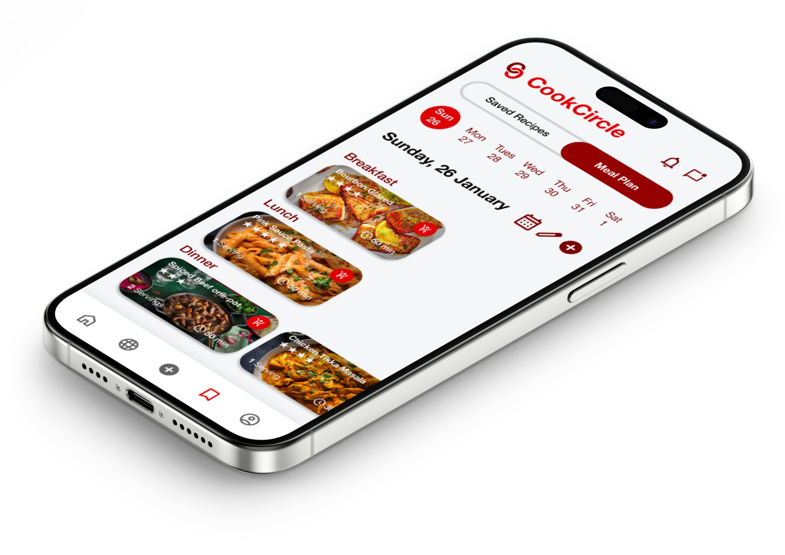
Plan recipes that fit your week.
Save your favorites, then organize meals for breakfast, lunch, and dinner.
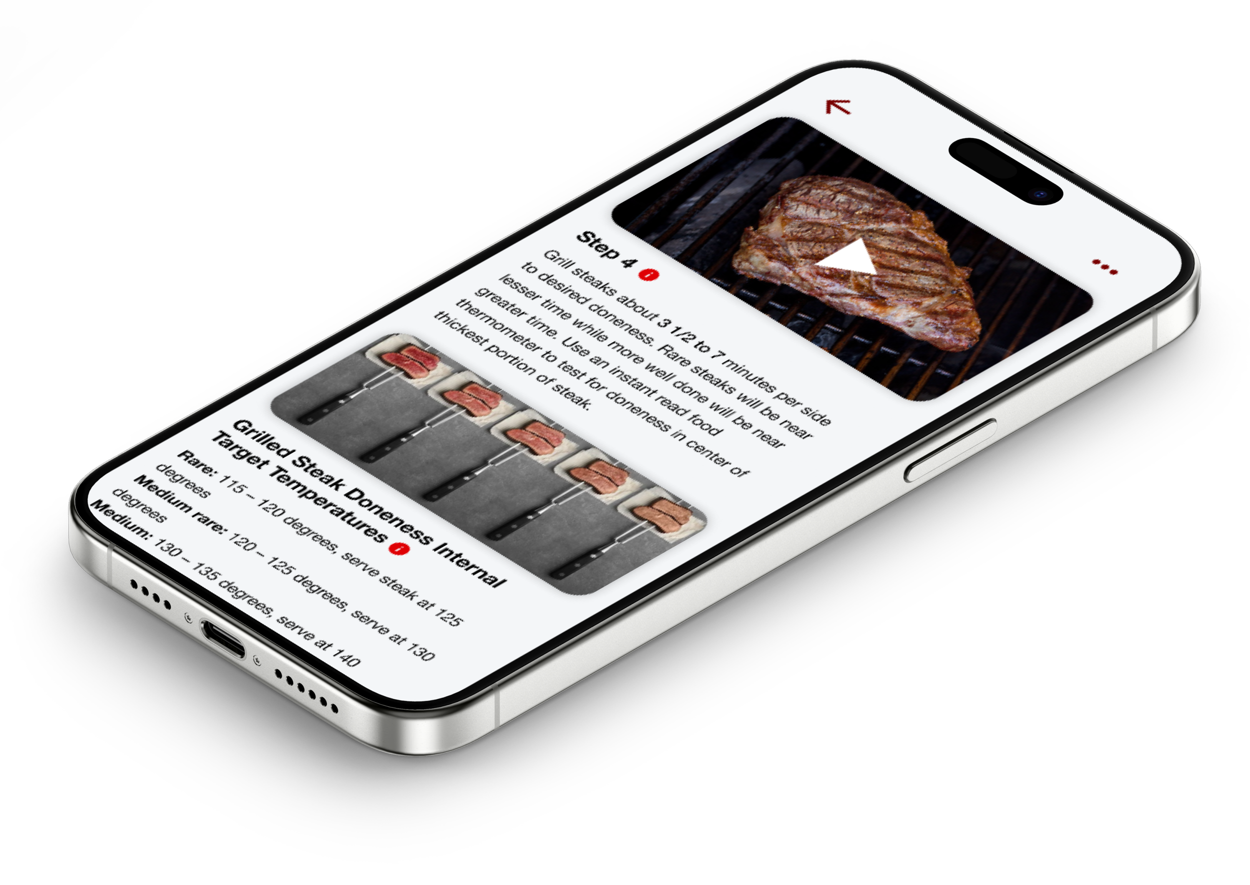
Confidence at every step.
Interactive instructions with tips, videos, and details when you need them.
CookCircle aims to simplify home cooking by providing an intuitive app that helps users discover recipes, meal prep, and execute meals effortlessly.
Project scope & time
Project Planning
9 Hours
Research
20 Hours
Prioritization
14 Hours
UI Design & Prototype
45 Hours
Testing & Iterations
12 Hours
My role as a UX/UI designer on this project
This was my first end-to-end capstone project at DesignLab, completed over several weeks (≈100+ hours). I was the sole UX/UI designer, responsible for everything: research, interviews, affinity mapping, competitor analysis, personas, flows, wireframes, branding, high-fidelity designs, and usability testing.
Research Goal
We want to know what motivates people to cook at home so that we can include features and consider many possible ways to make our app engaging and push people to learn the new skill of cooking / motivating them.
I talked to people at different cooking levels — from beginners just learning the basics, to more experienced home cooks, to those who’ve worked in food service.
I also looked at cooking app competitors like SuperCook, Yummly, Tasty, and BigOven to see what they did well — and where they fell short.
Interviews: I conducted 4 semi-structured interviews with a mix of people who cook at home, are learning to cook, or track their diets (Jordynn, Kathy, Susan, Nathan). Each lasted 20–30 minutes and was remote.
Competitive Analysis: I studied SuperCook (ingredient-based search), Yummly (personalized recommendations), Tasty (video-first), and BigOven (meal planning + leftovers) to see what worked well and where gaps remained.
Research - Competitive Analysis
I began by examining popular cooking and meal-planning apps to see what already works well and where users’ needs might still be unmet. Looking at cooking app competitors like SuperCook, Yummly, Tasty, and BigOven to see what they did well — and where they fell short.
Strengths across competitors: recipe discovery, step-by-step instructions, and meal planning tools.
Common gaps: lack of simplified filters, limited confidence-building features for beginners, and weak social/community engagement.
This analysis highlighted an opportunity for CookCircle to stand out by creating an engaging, user-friendly app that builds cooking confidence while also making planning easier.
Research revealed
Time is the biggest barrier. People want cooking to fit into busy schedules.
Confidence matters. Beginners worry about messing up steps or not knowing techniques.
Variety keeps people engaged. Users don’t want to make the same meals repeatedly.
Planning feels overwhelming. Grocery shopping and meal prep are stressful without guidance.
Apps often overcomplicate things. Too many ads, cluttered designs, or irrelevant suggestions.
User Interviews and Affinity mappig
To gain deeper insight into the real challenges people face, I conducted contextual interviews with a diverse mix of participants from beginner cooks to experienced. After synthesizing the interview data into an affinity map, clear patterns emerged:

Barriers:
Time and effort make cooking feel like a burden.
People struggle with deciding what to cook.
Small kitchens and wasted ingredients add frustration.
Motivations:
Cooking at home is healthier and more affordable.
Many enjoy learning new skills and having control over their meals.
What users want in an app:
Easy-to-follow recipes with visuals.
Personalization for diets and preferences.
Community-driven features like reviews and grocery list integration.


Turning Ideas into Structure: Starting with Low-Fidelity Wireframes
Before diving into the visuals, I mapped out the essential screens and user flows using low-fidelity wireframes. This allowed me to focus on functionality and navigation by making simple layouts before refining the details.
Defining the Look and Feel: Building a Visual Identity

Once the structure felt right, I shifted to branding and visual direction. I started with a moodboard to capture the app's personality. Modern, clean, and creative.
The goal was to balance professional networking with a creative energy that inspires users to share their work.
I designed two logo concepts, testing different ways to make the brand feel bold yet approachable. The final logo reflects simplicity and clarity, aligning with the clean UI and creative tone I wanted to convey.

Colors That Spark Creativity and Fonts That Feel Familiar
For typography, I chose SF Pro, Apple’s system font, for its clean, highly legible style and modern appeal—a familiar feel that makes navigation intuitive. For color, I went with a bright orange as the primary brand color, symbolizing creativity, enthusiasm, and boldness, paired with neutral tones for a balanced, professional look.

Bringing It All Together: High-Fidelity Wireframes & UI
With the branding in place, I applied it to the wireframes to create high-fidelity designs that combined usability with a strong visual identity. I refined every detail—from the structure of the posting flows to the visual hierarchy of the feed—to make sure the design felt cohesive, polished, and easy to use
HIGH WIREFRAMES SAMPLES


Over the course of research, design, and iteration, that idea transformed into a high-fidelity prototype that feels like a real product.
This project taught me the value of starting simple, validating early, and letting user needs guide decisions. It reinforced that UX design is never really “done”, it’s a cycle of creating, testing, and refining. I also learned how important storytelling is in both the product and the process.
I’m proud of how cohesive and polished the final design feels, especially the way it captures creativity and professionalism in one platform. More than that, I’m proud of the process, how every decision, from color choice to navigation, was intentional and backed by research and inspiration.
